
Typeface Design
(2023- present)
Ever since realizing my passion for typography in 2023, I have been fascinated with researching, and ultimately creating, my own typefaces. My 2025 thesis project and exhibition-a requirement to graduate from Oakland University’s Honors College-was centered around researching ornamental typefaces and designing one of my own. Since the birth of New Sheriff, I have designed various modular typefaces with the goal of making them available to the public.
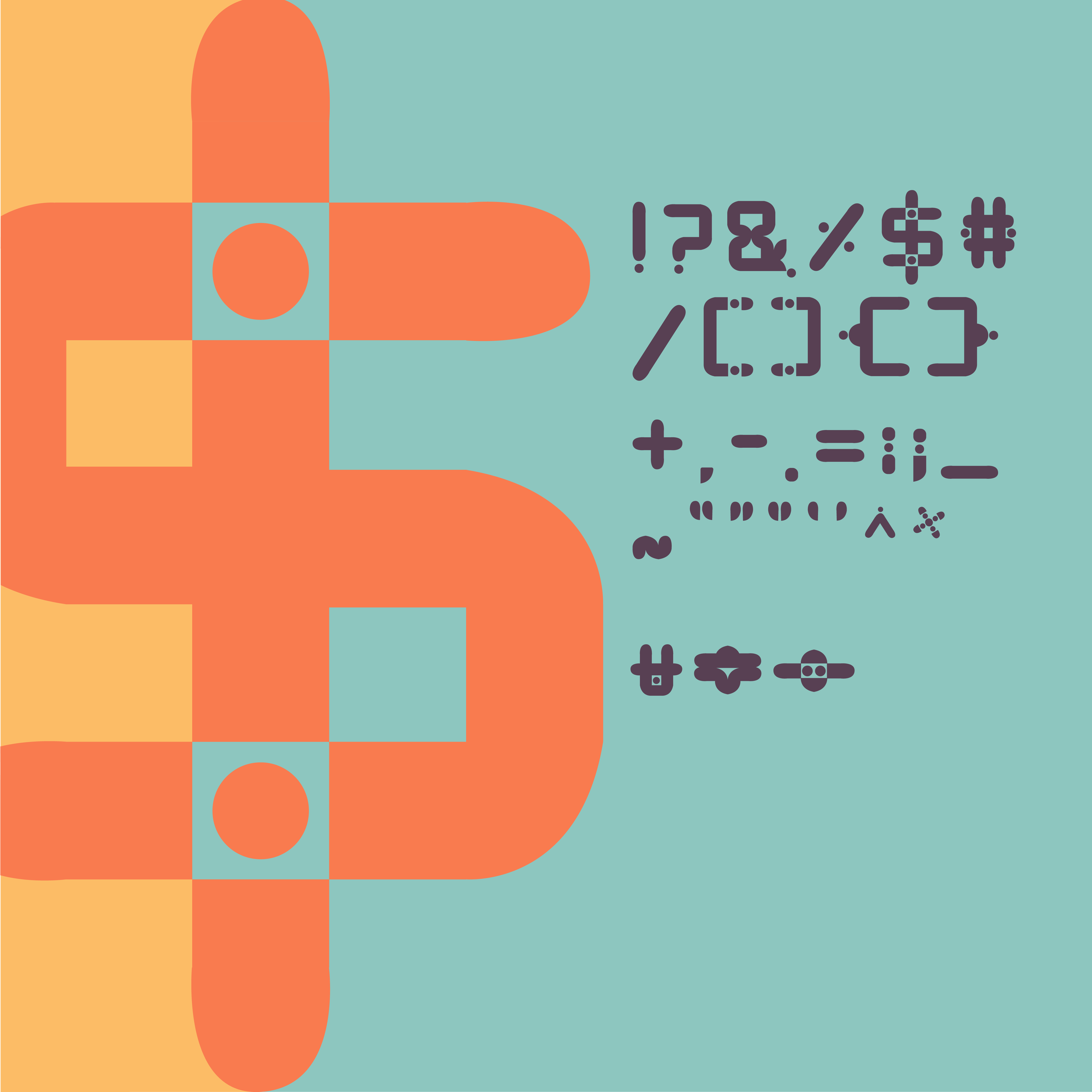
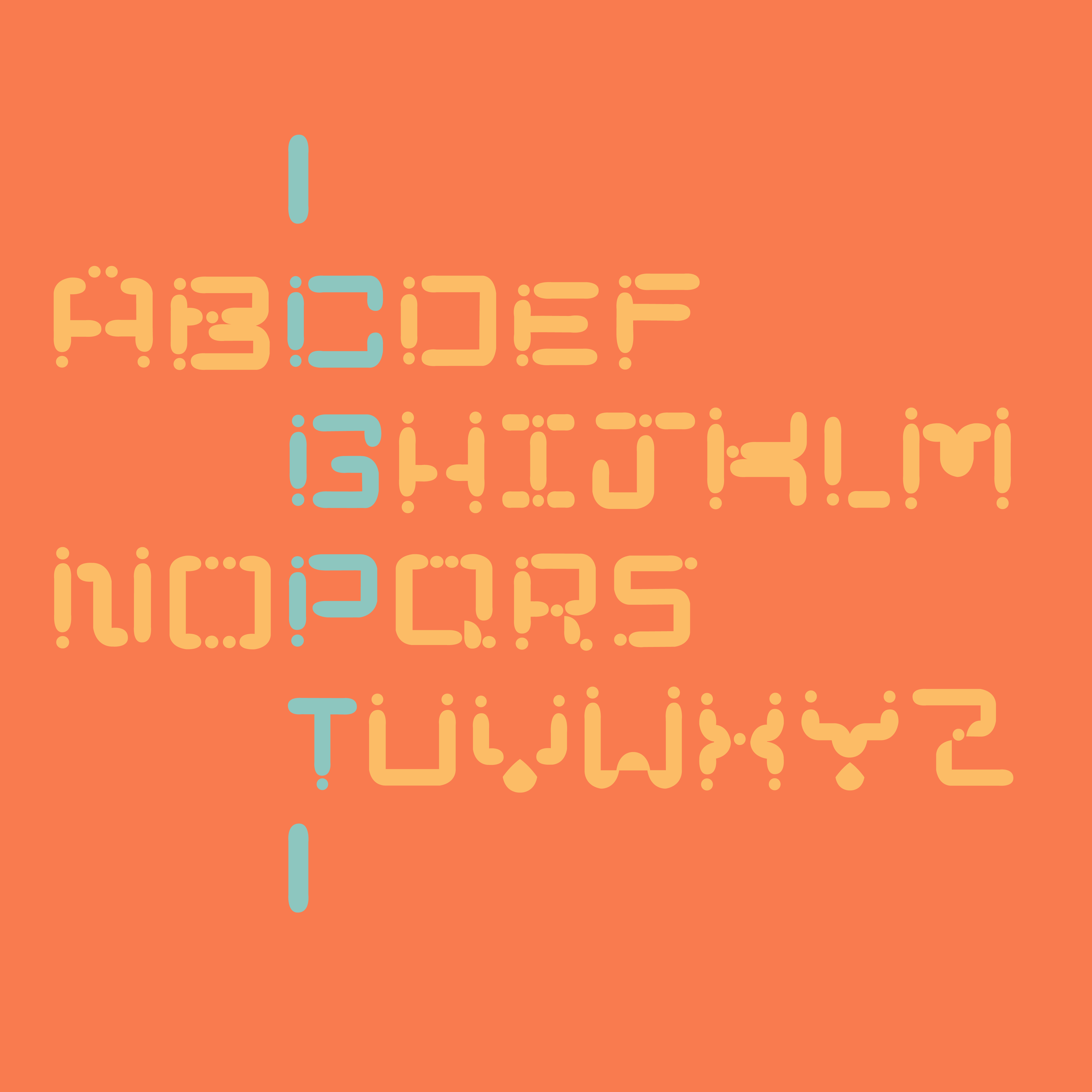
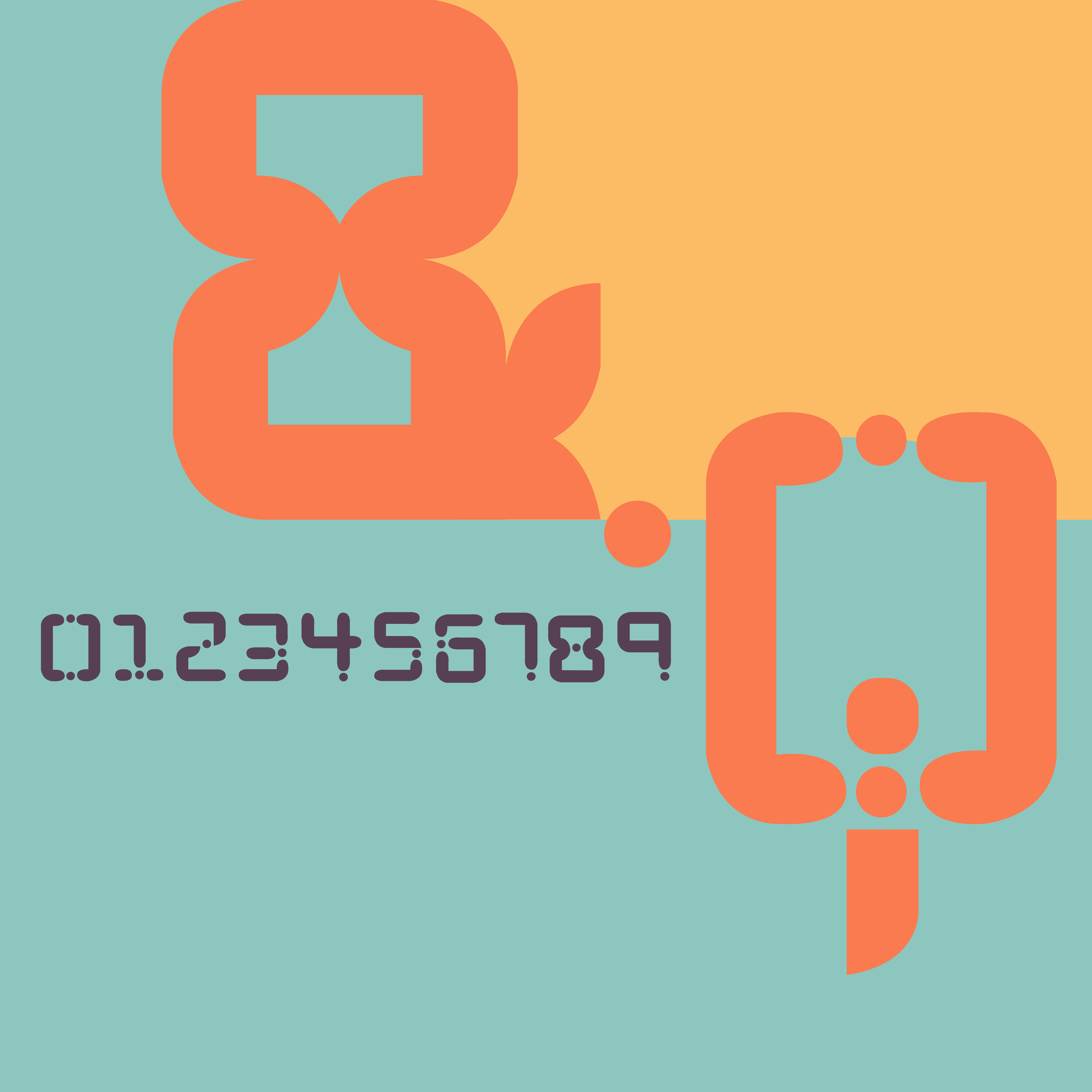
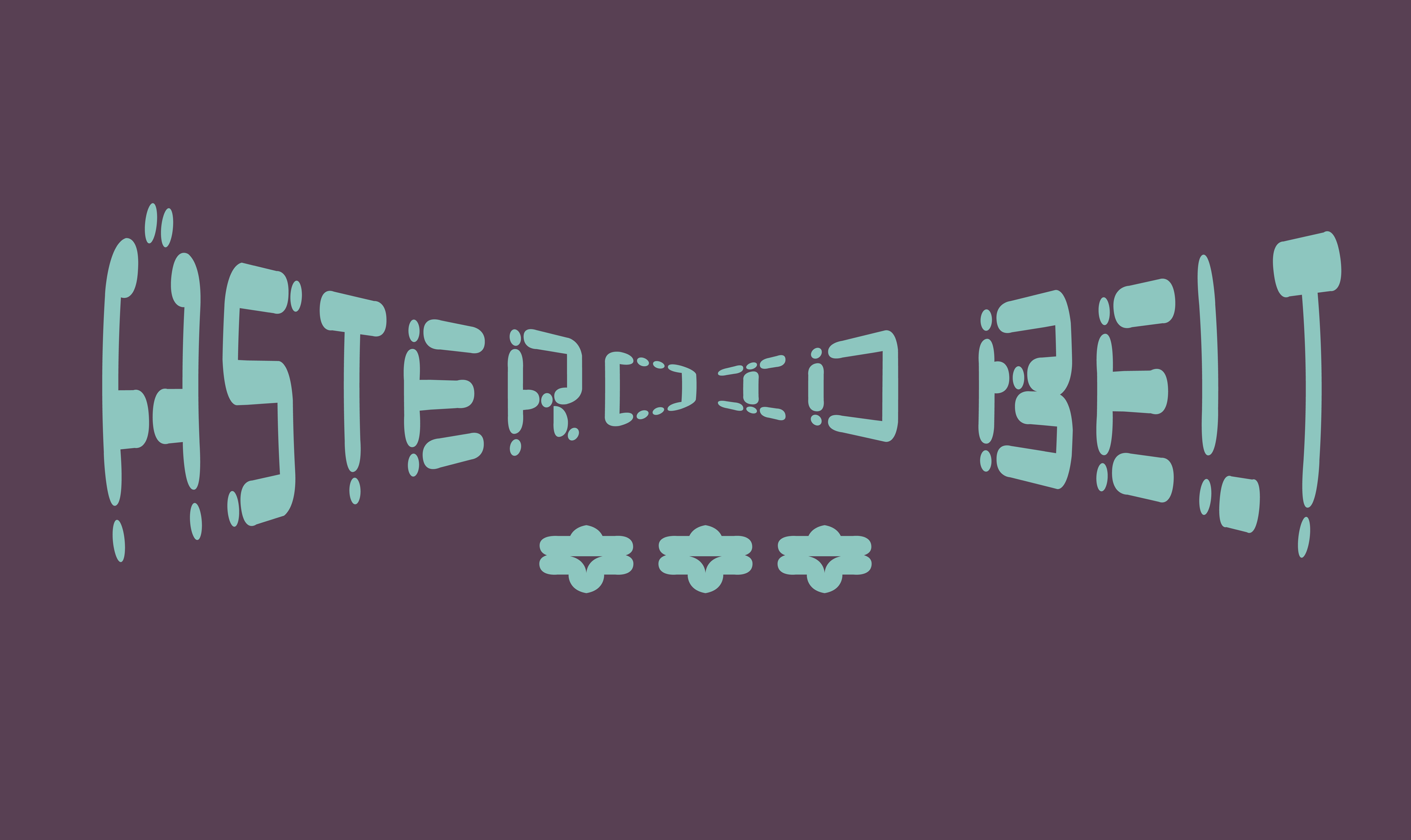
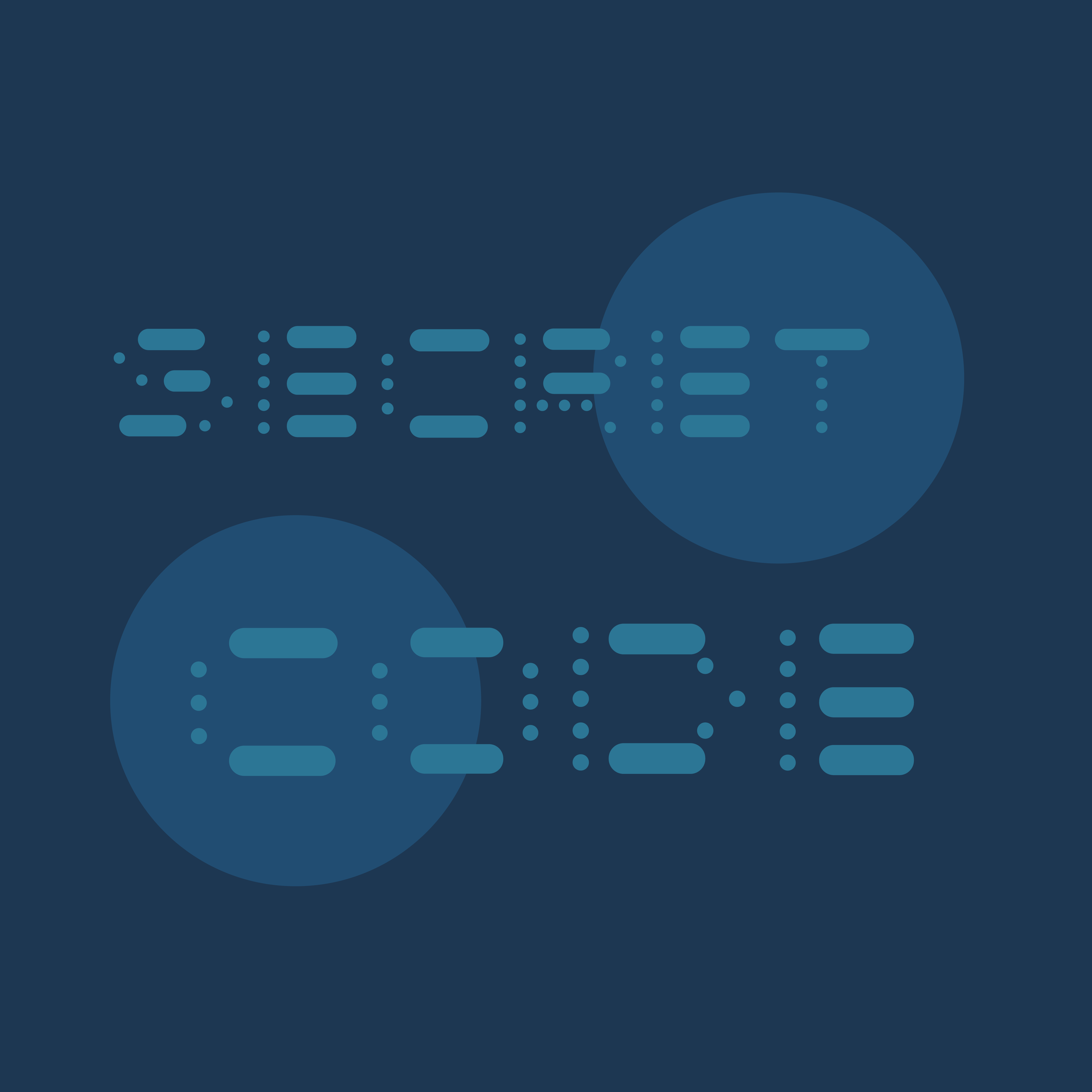
Asteroid Belt
Modular Typeface (2026)
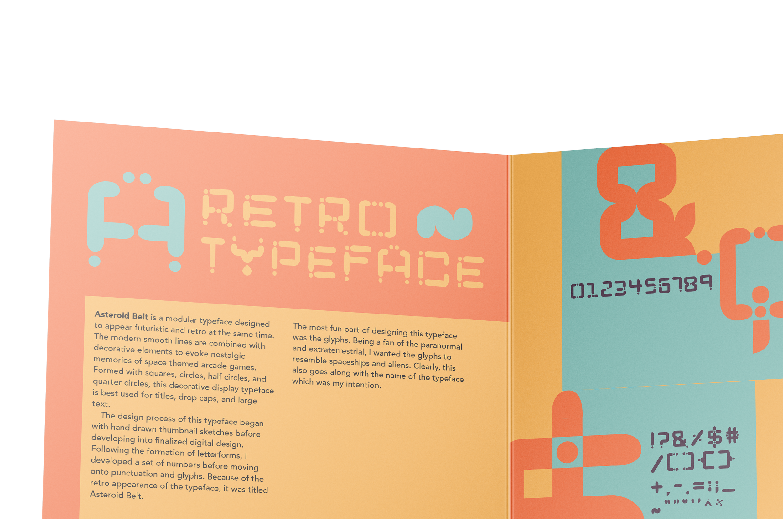
Asteroid Belt is a modular typeface designed to appear futuristic and retro at the same time. The modern smooth lines are combined with decorative elements to evoke nostalgic memories of space themed arcade games. Formed with squares, circles, half circles, and quarter circles, this decorative display typeface is best used for titles, drop caps, and large text.

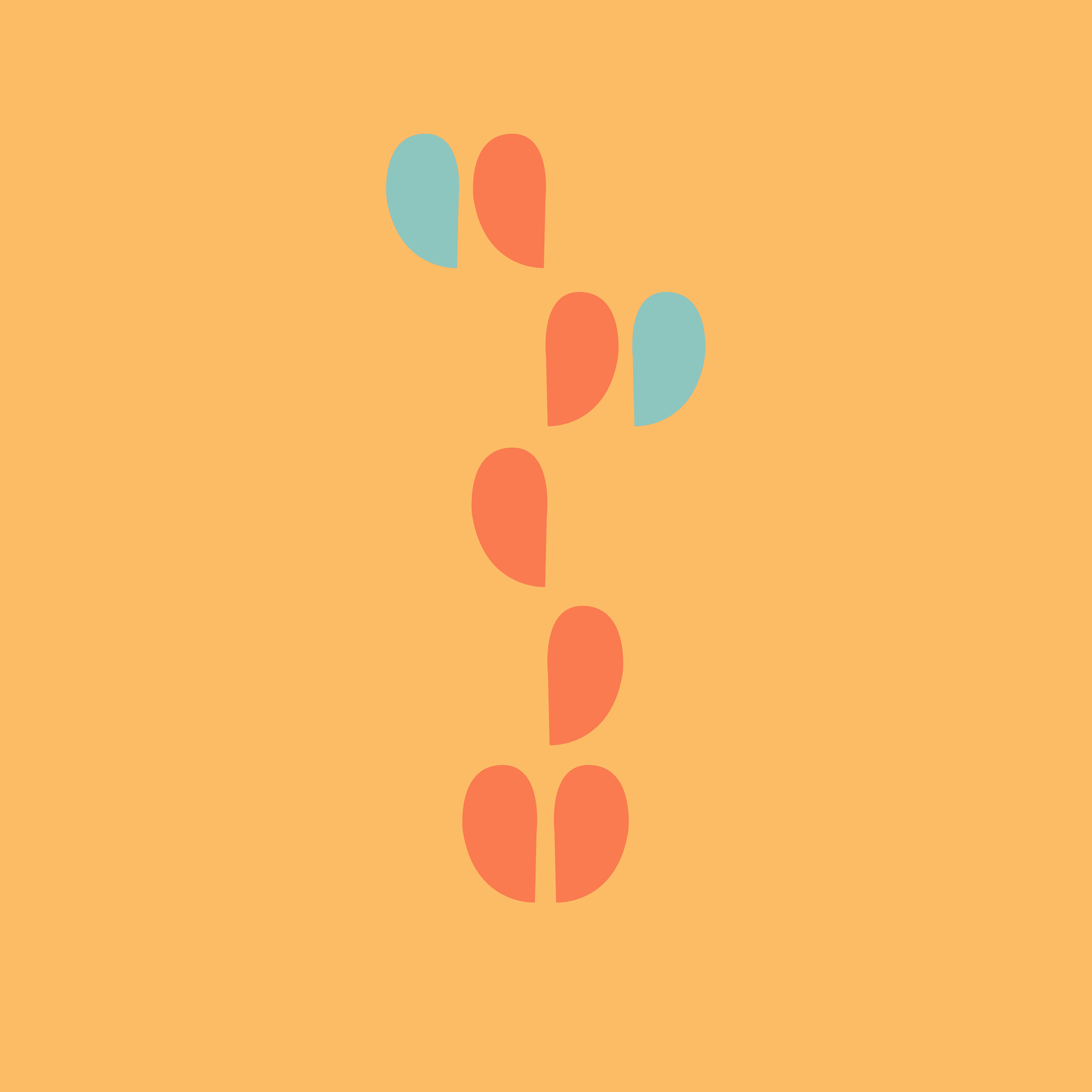
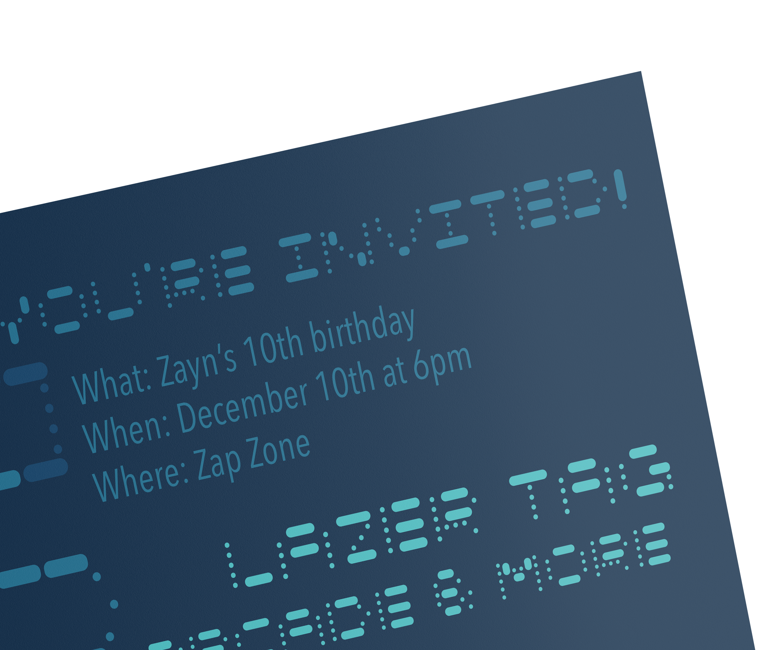
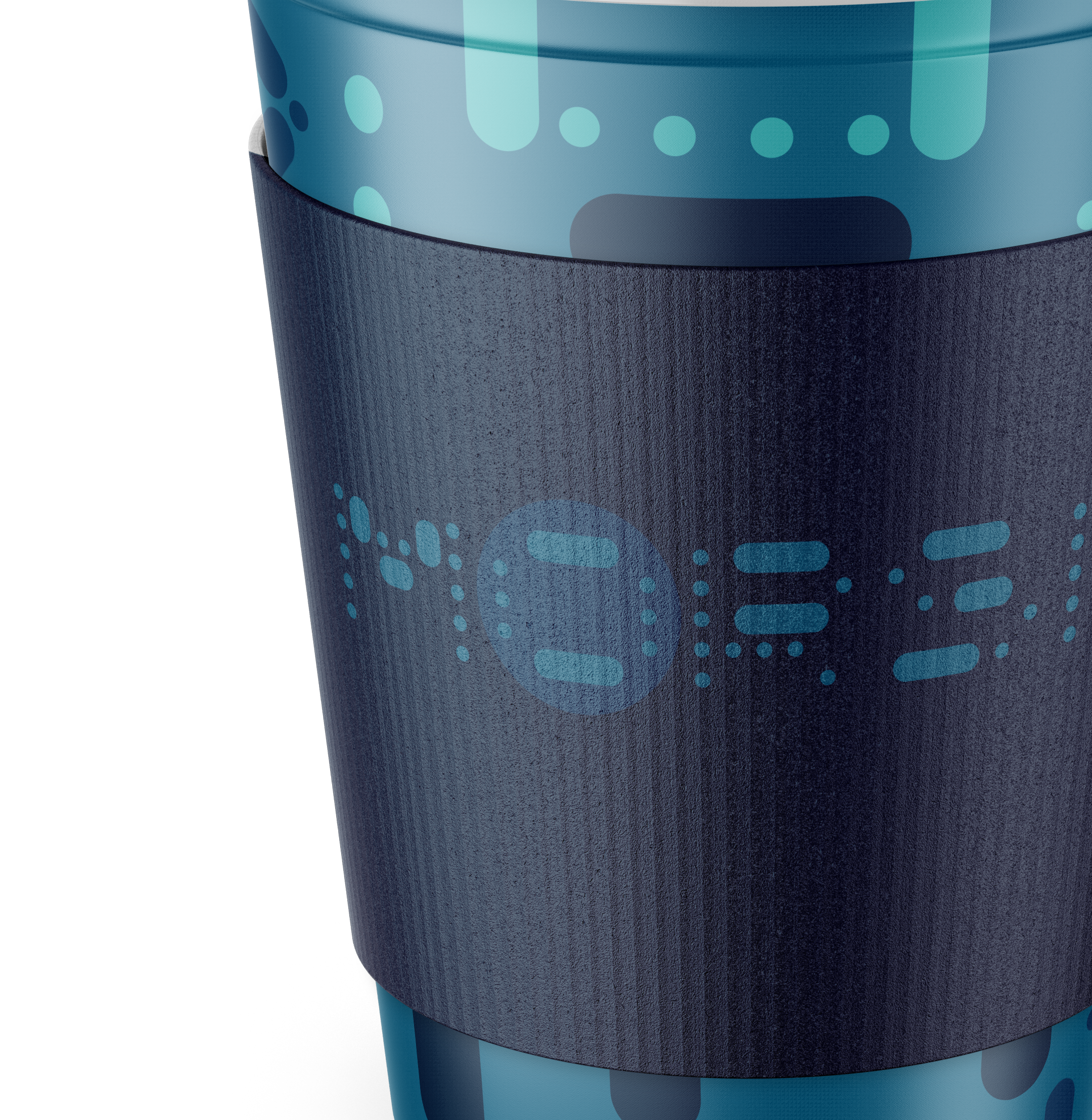
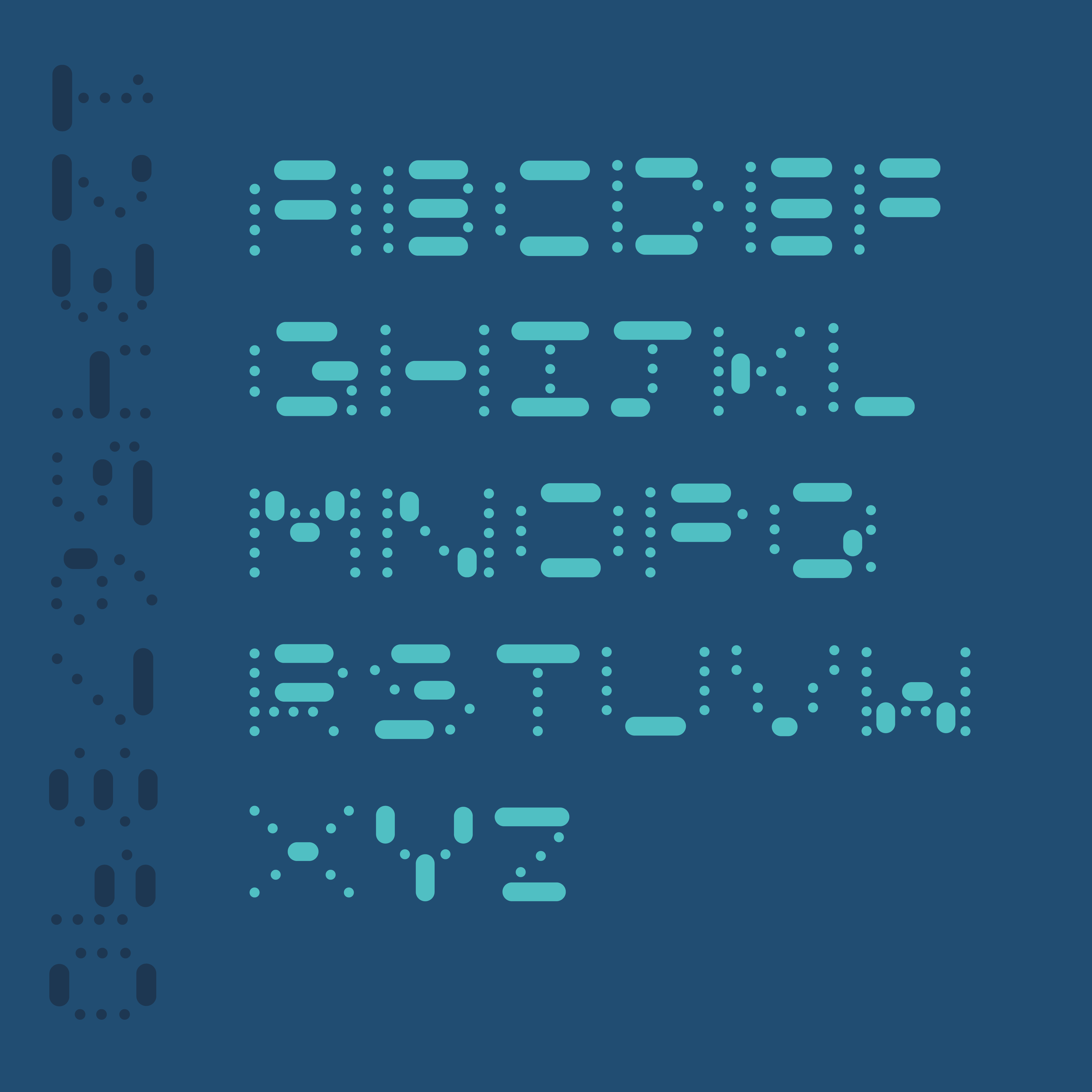
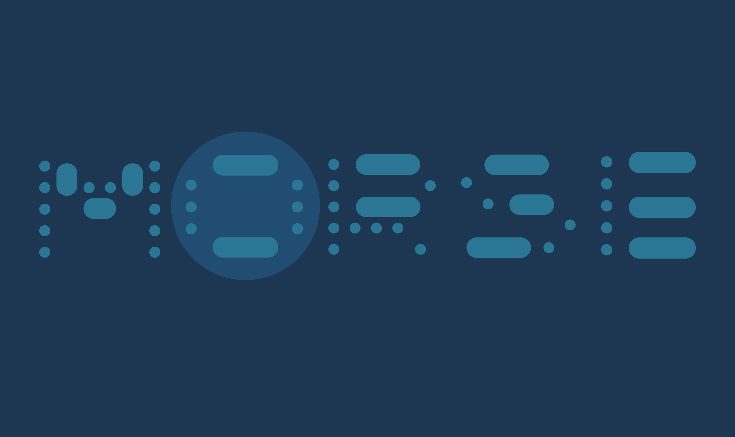
Morse
Modular Typeface (2026)
Morse is a modular typeface designed to resemble a blinking pattern similar to certain codes like morse code. Using a series of circular modules, this decorative display typeface is best for titles, headings, drop caps, and large text. Much like code itself, Morse is designed to be difficult to immediately interpret. The audience must look at, and analyze, the typeface for a few minutes to be able to read it.


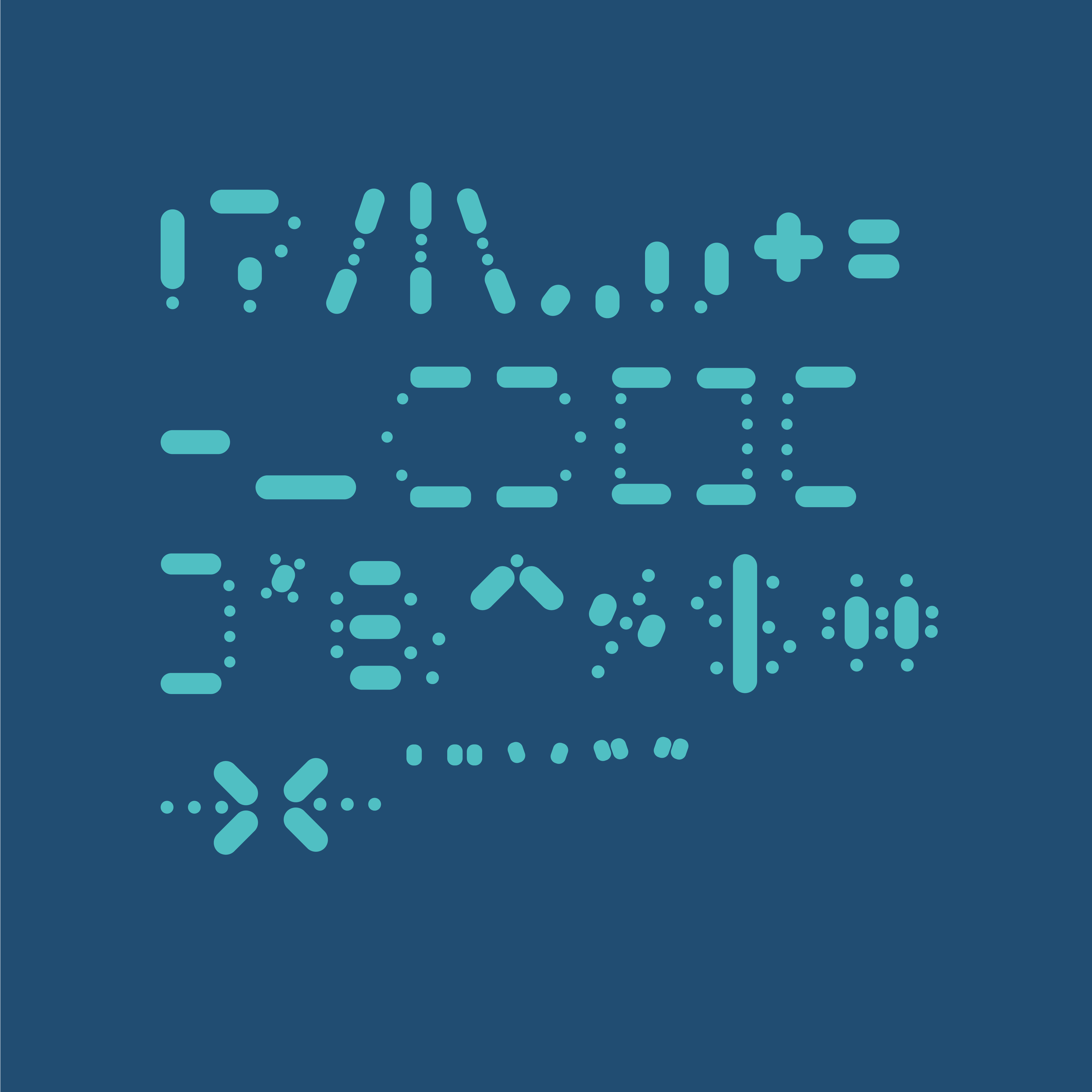
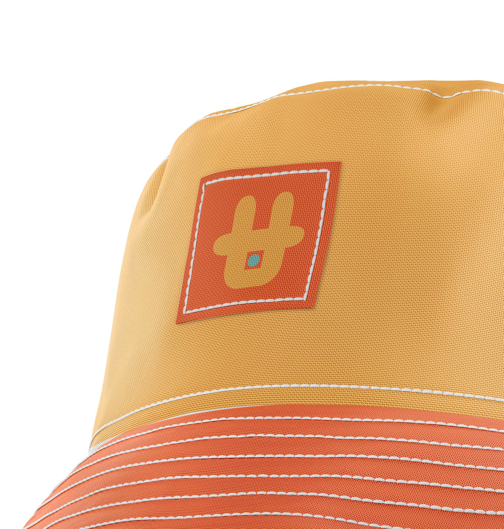
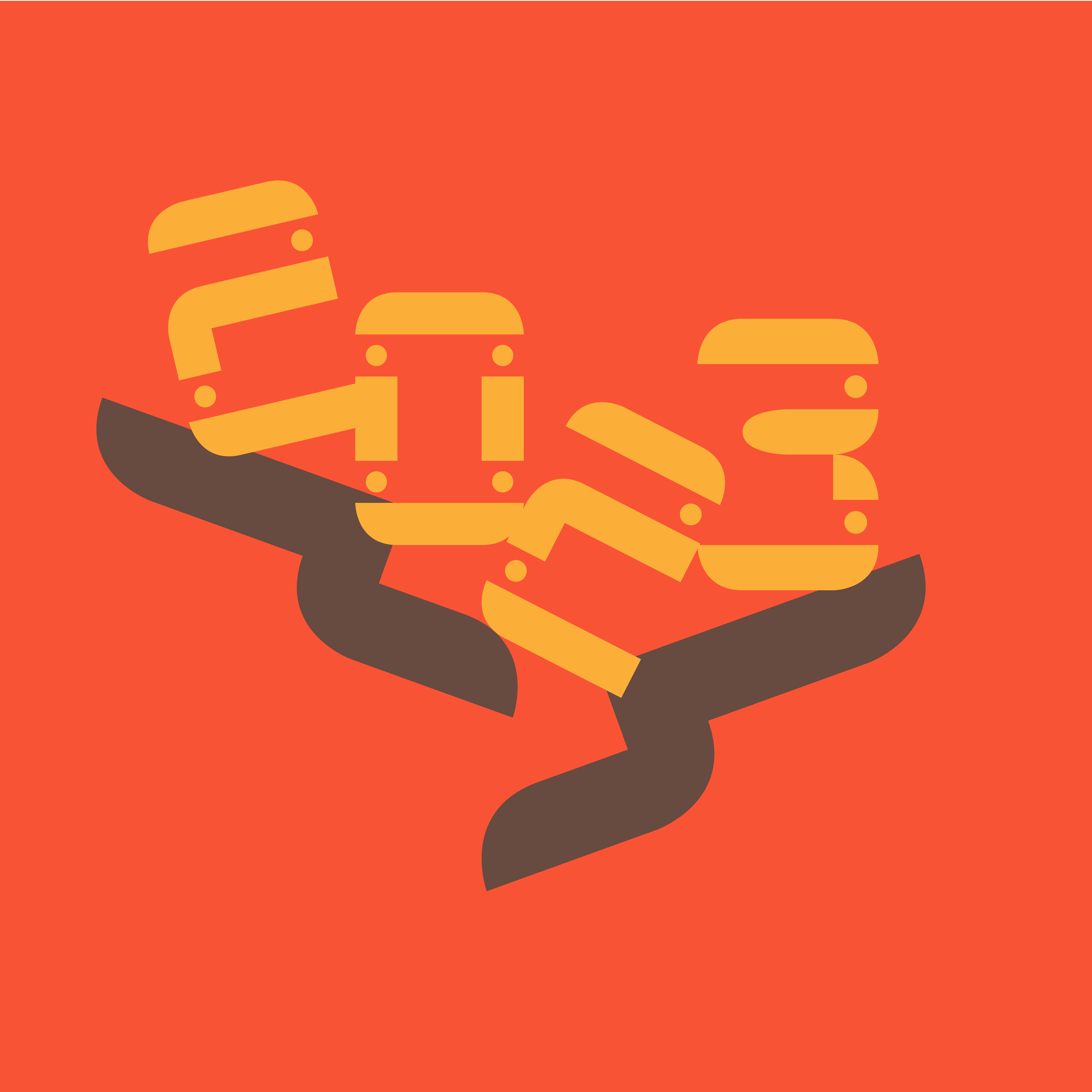
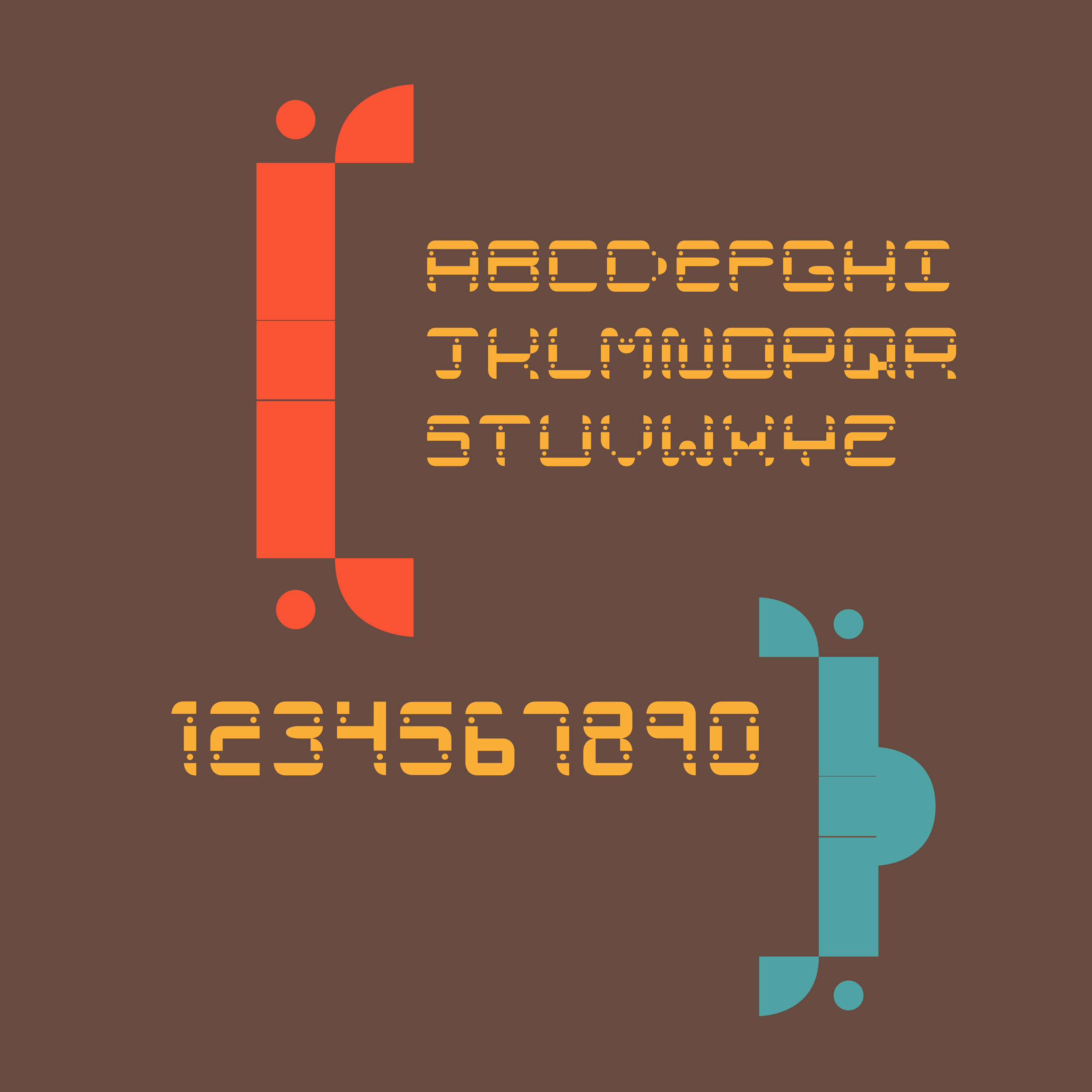
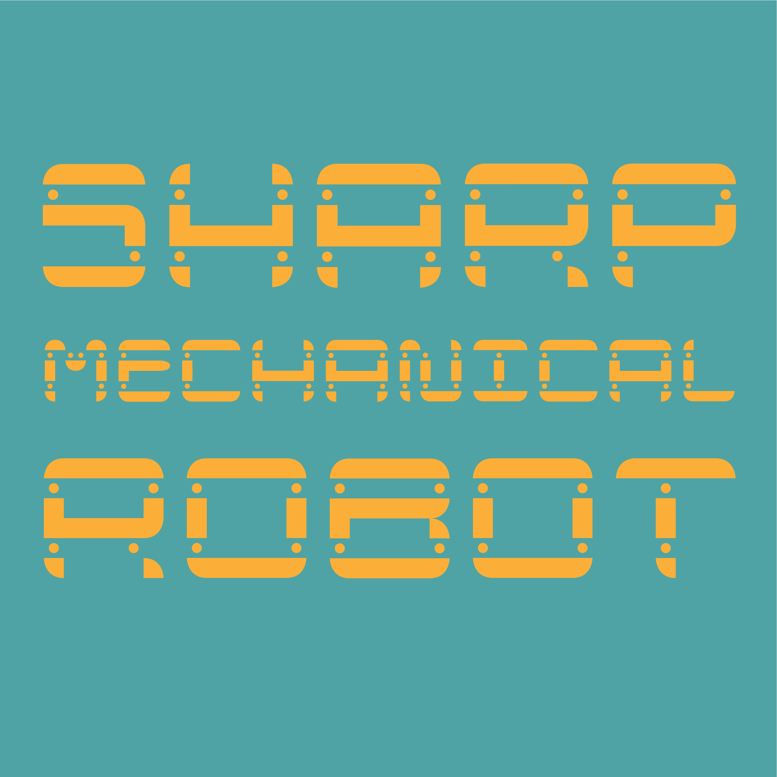
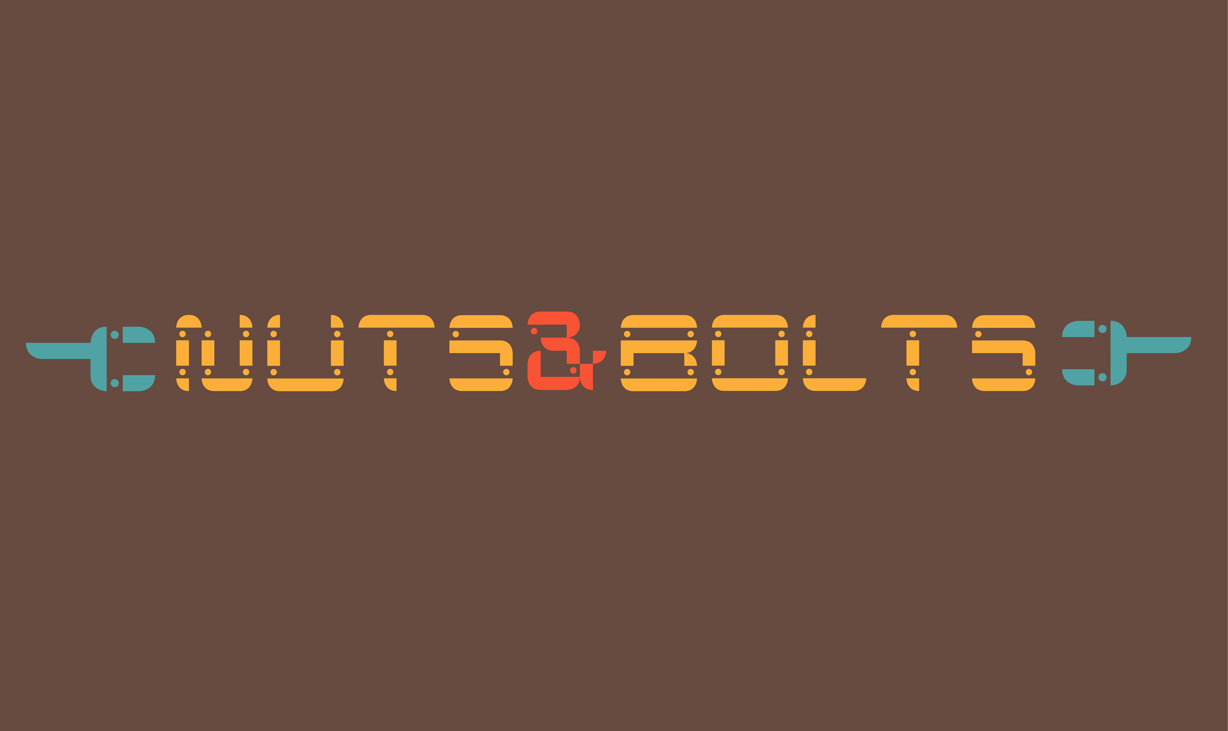
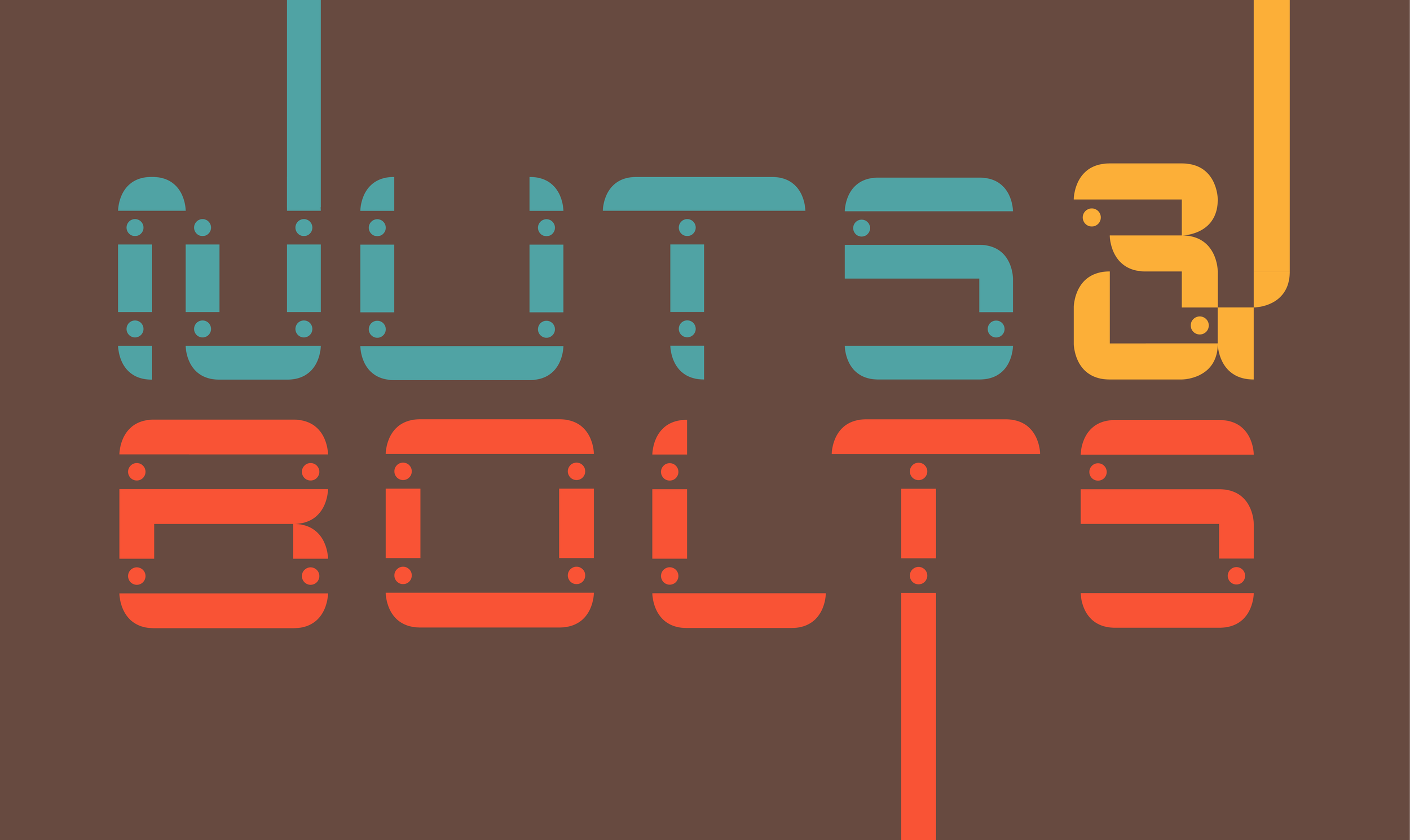
Nuts & Bolts
Modular Typeface (2023)
Nuts & Bolts is a modular typeface designed to appear mechanical. It is formed with squares, quarter circles, half circles, and small dots resembling bolts. The complex design of this typeface makes it perfect for titles, drop caps, and even song lyrics... especially metal!
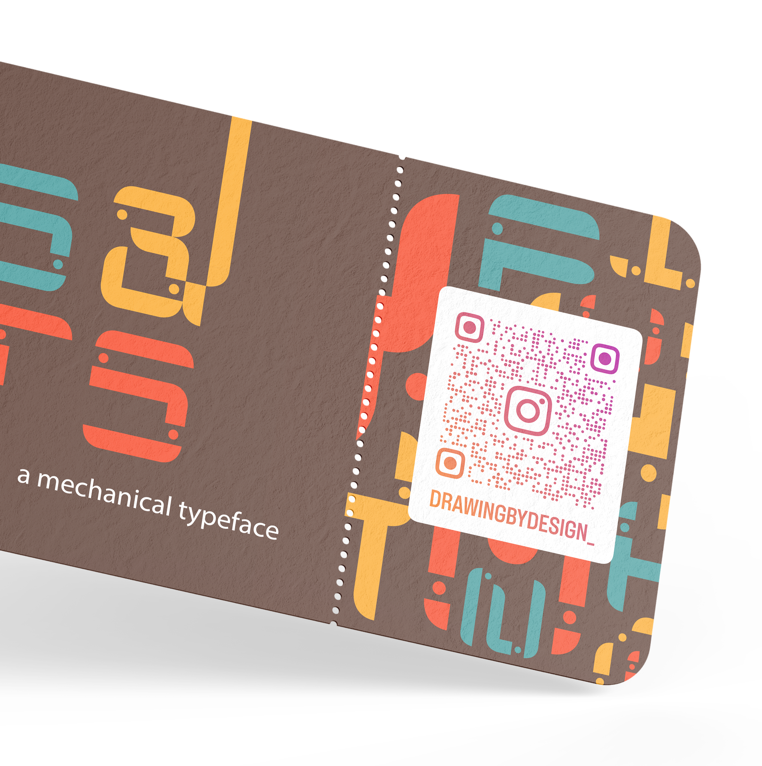
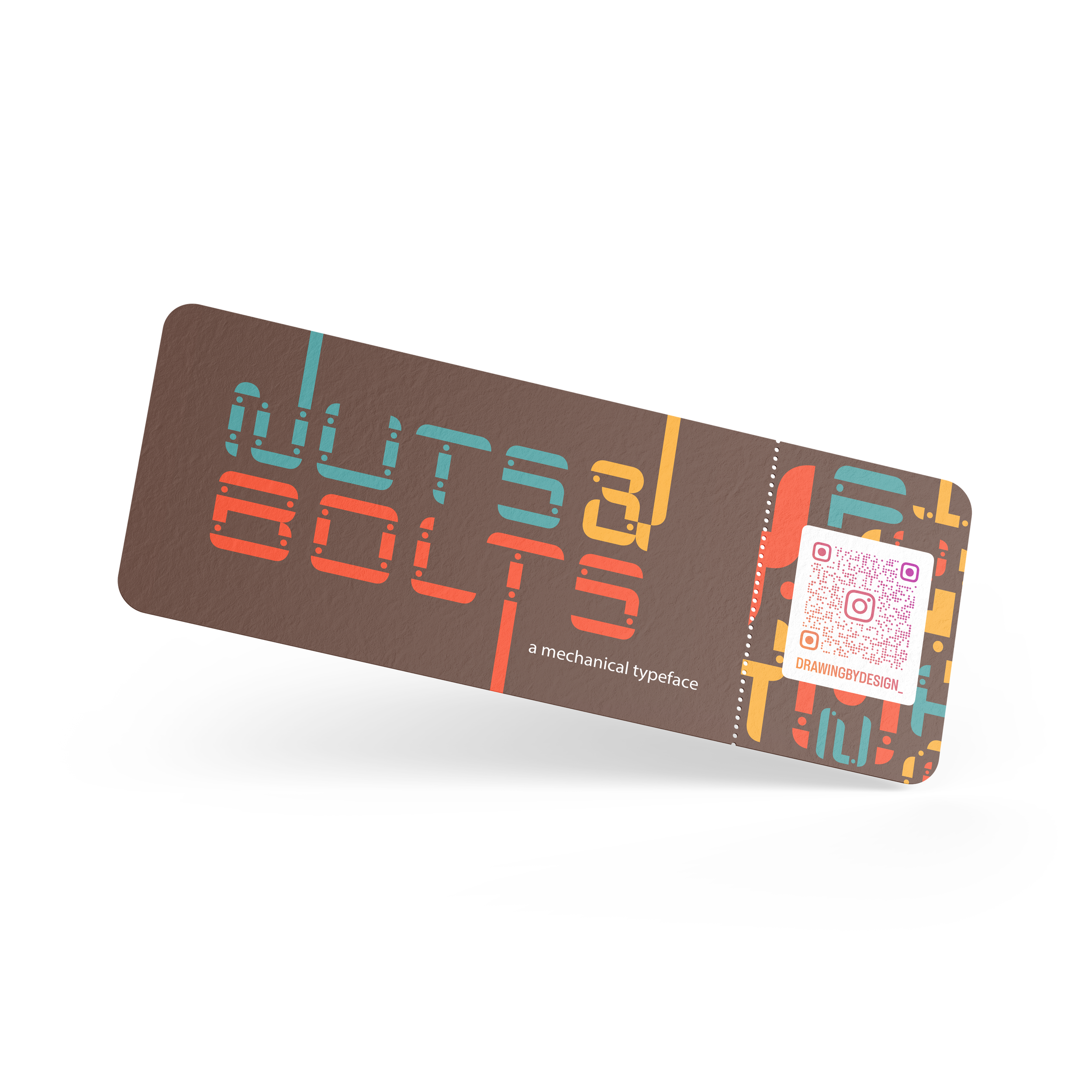

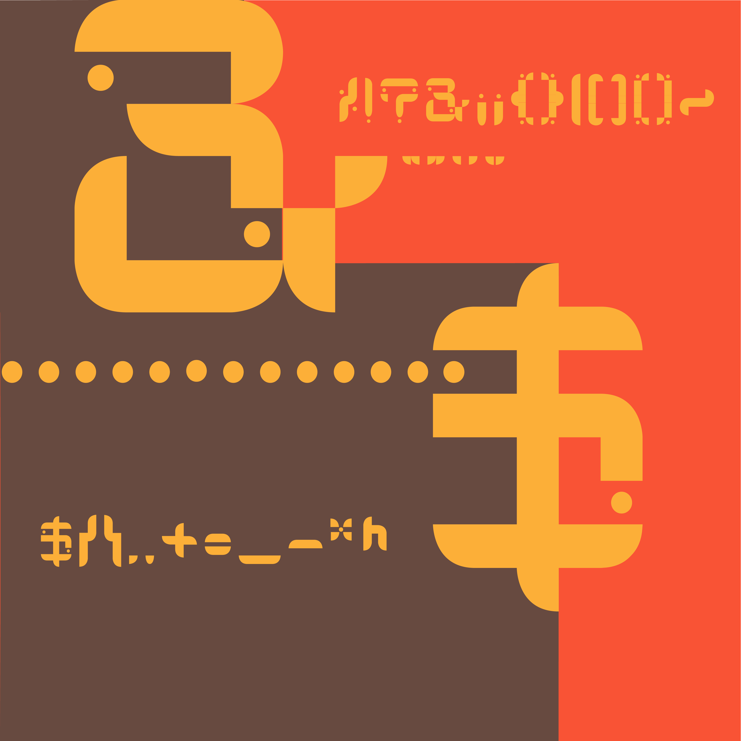
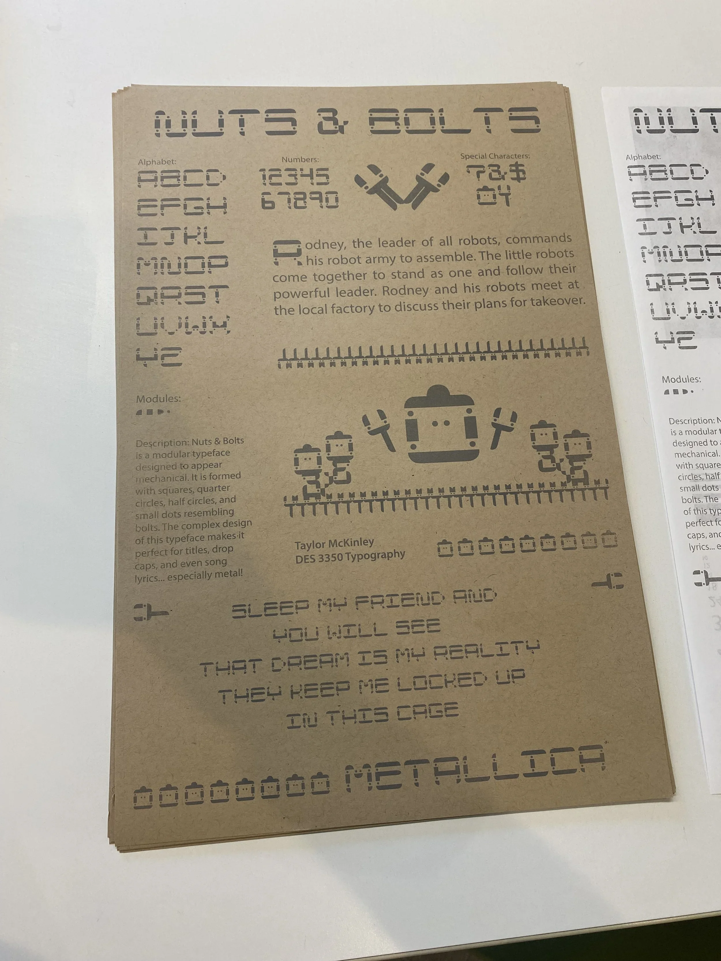
Shown above is a typeface broadside showcasing Nuts & Bolts, made using a Risograph printer.
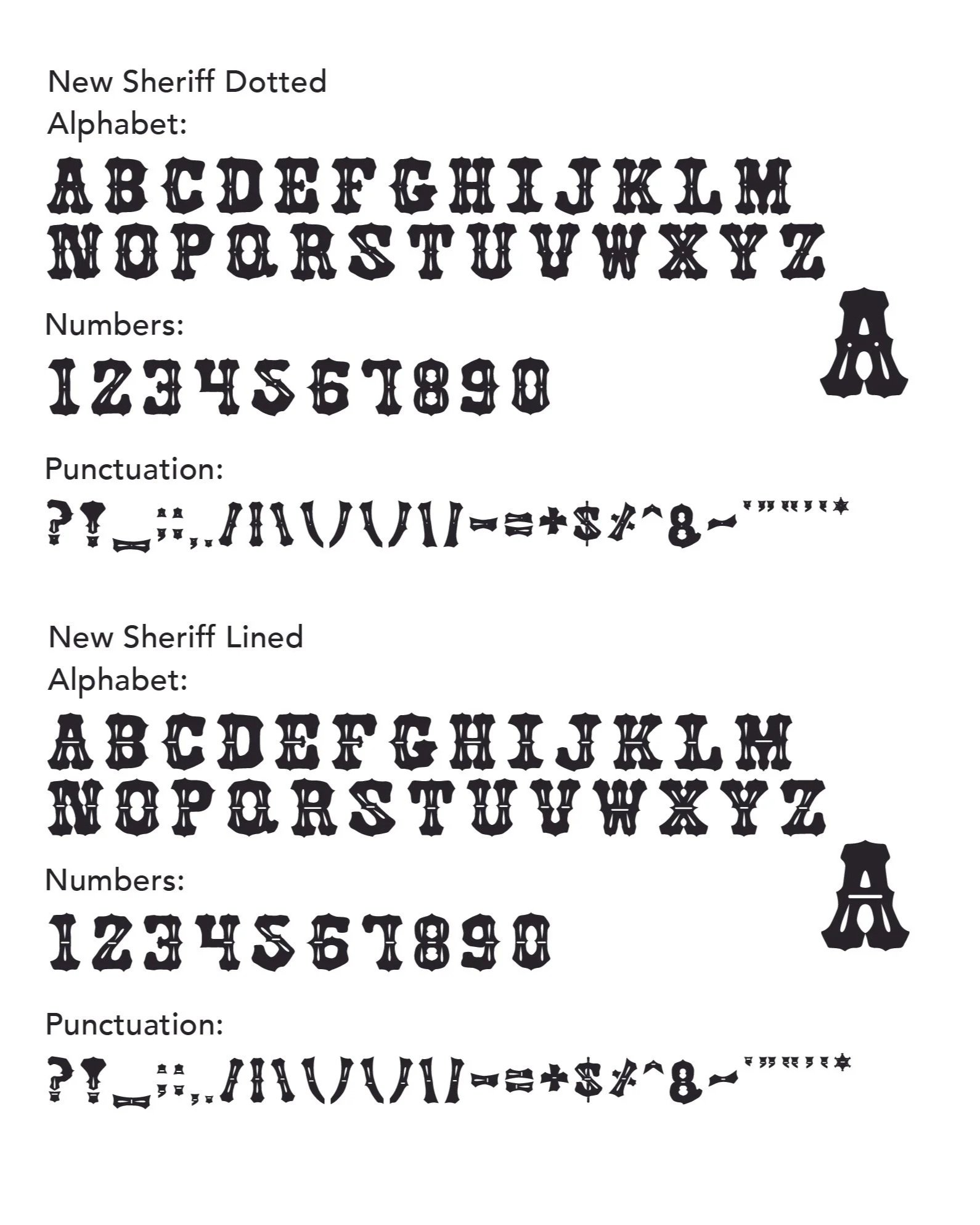
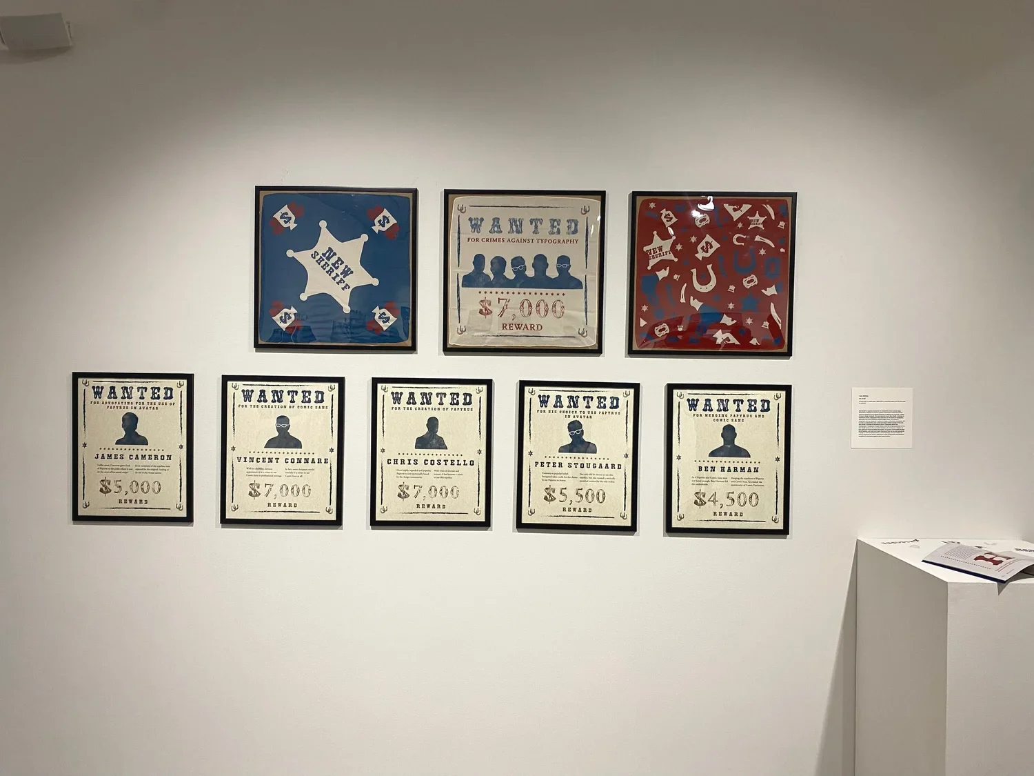
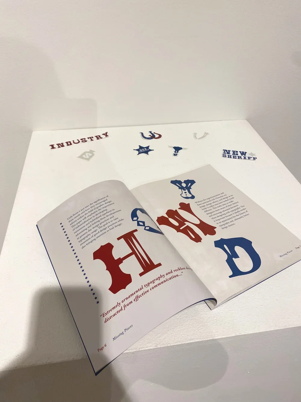
New Sheriff
Type Family (2025)
New Sheriff is a type family including four variations of New Sheriff Solid, New Sheriff Dotted, New Sheriff Crossed, and New Sheriff Lined. This typeface was designed to combine the likeness of nineteenth century ornamental design with current day design trends. New Sheriff recognizes legibility while embracing the decorative elements of typeface design during industrialization. Each type style features unique letterforms, punctuation, and numbers, with only the glyphs being the same throughout.
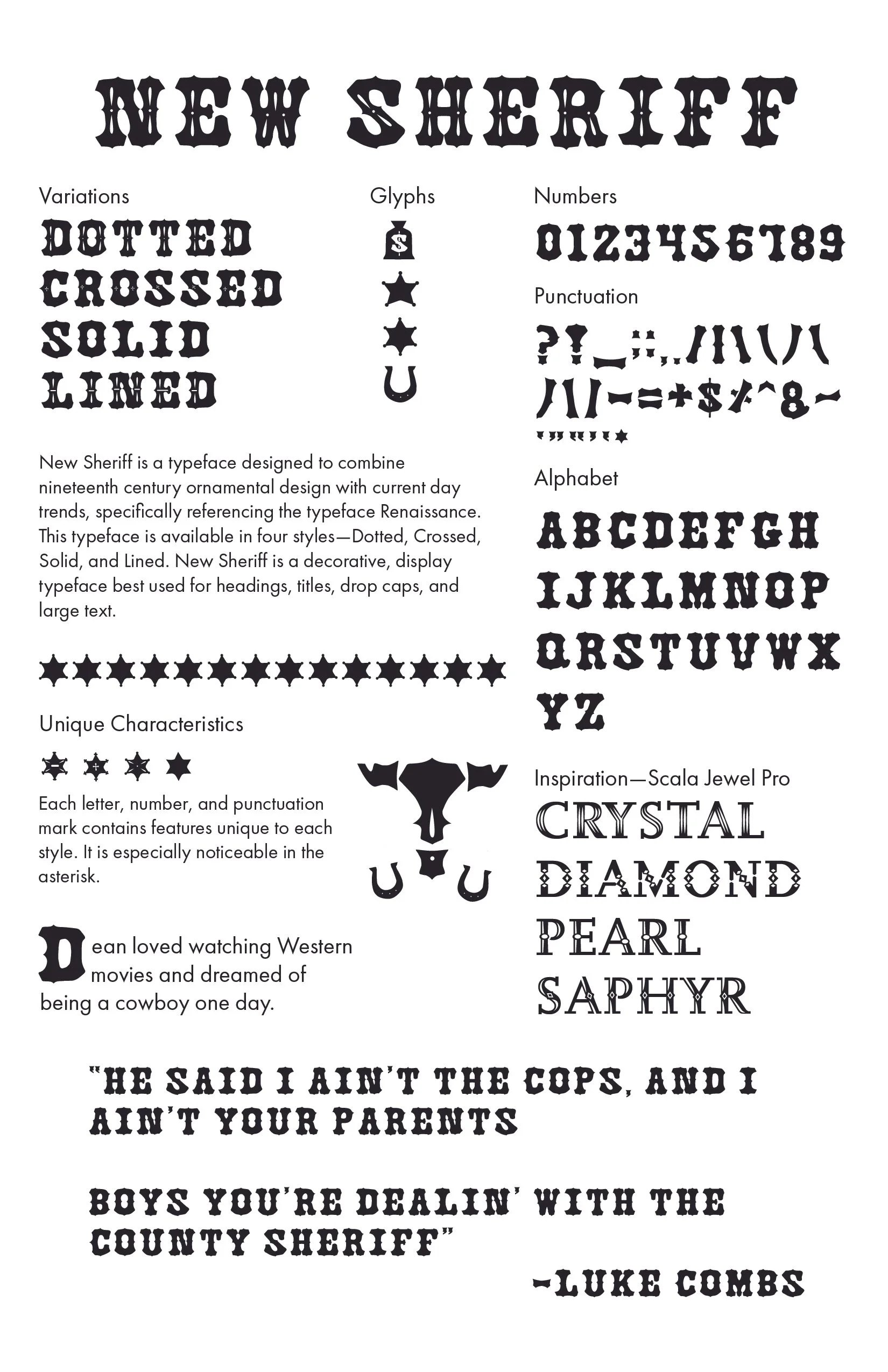
I designed New Sheriff for my university thesis project, not only designing the typeface itself, but showing it in action through additional design elements.
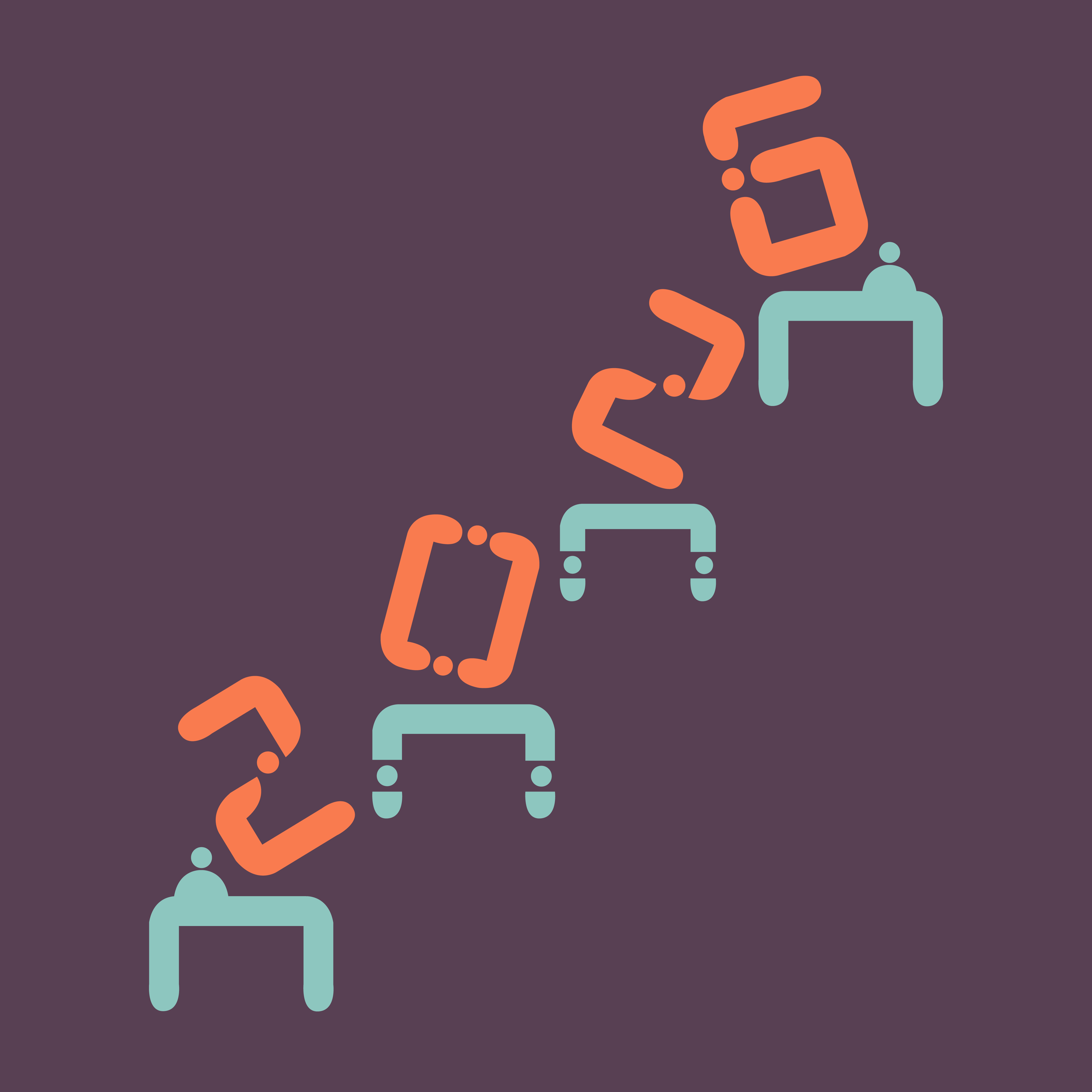
The Process
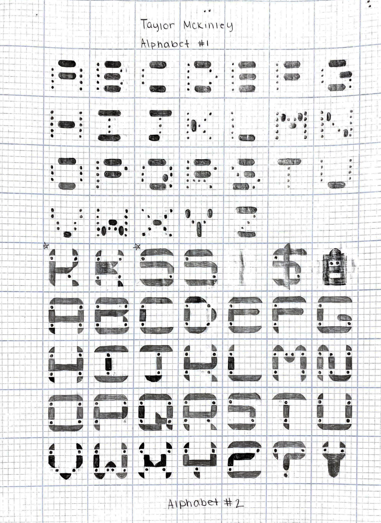
I approach all of my typeface design projects the same-starting off with hand drawn thumbnail sketches on graph paper to develop letterform trends. The image on the left shows the early stages of Nuts & Bolts, and Morse. Following this step, I scan my sketches and upload them to Adobe to begin digitizing my typeface. After many months and refinement, a typeface is born!